The Unoriginal Bathroom Company
Logo Design.
Branding.
Agency
Year
BOLD LIP Studio
2023
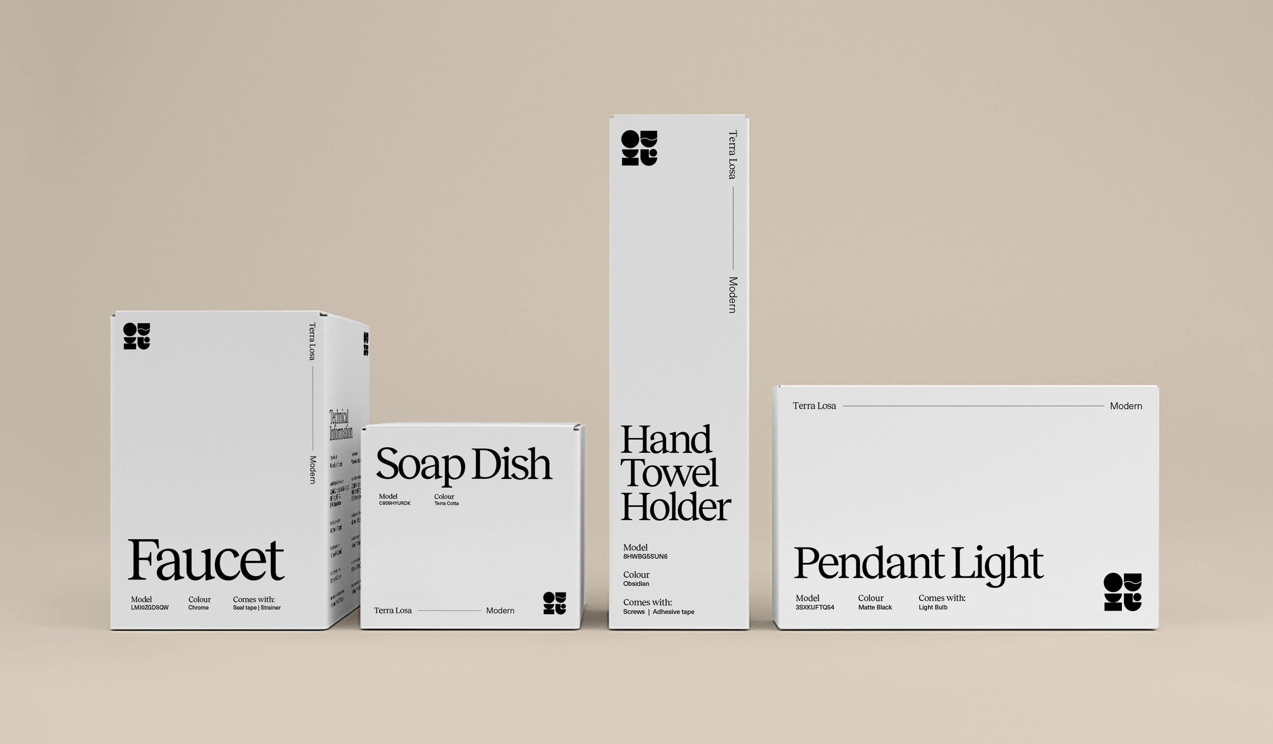
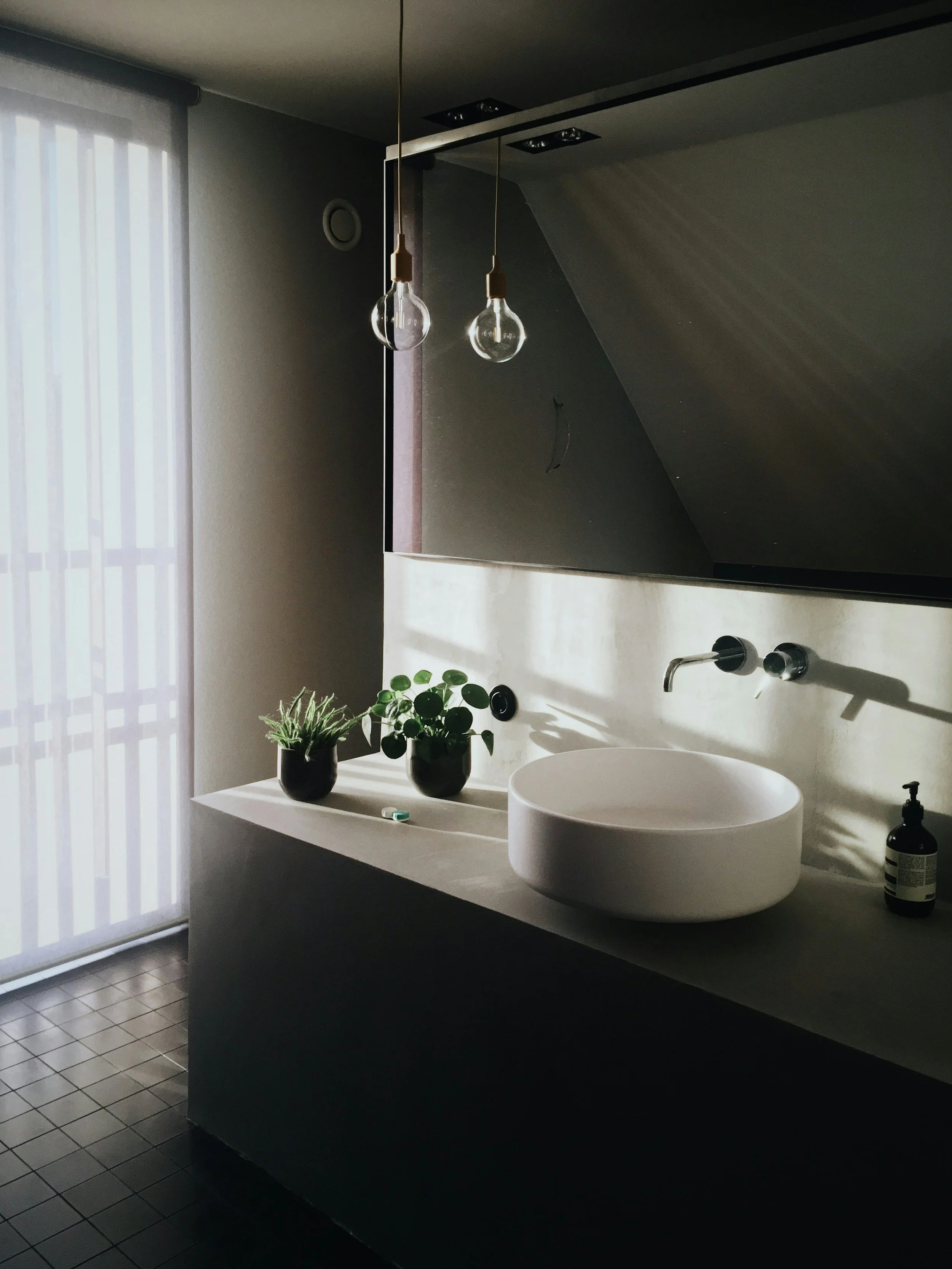
The Unoriginal Bathroom Company is a curated, simple, and systematic alternative to bathroom renovation chaos.
Homeowners want beautiful bathrooms, but they often have to make a million decisions to get there. (Who has time to shop for tiles???) The Unoriginal Bathroom Company simplifies the process by providing bathroom design collections and doing all the sourcing for their clients. All the client has to do is pick a design, talk to the TUBCo experts, and they’ll get everything they need in one delivery for their pros to install.
The Ask
The client was looking for a sophisticated branding to reflect their premium services. It’s high quality and tasteful, but not luxury (Think Audi, not Porsche).
They want a logo that’s playful (but not childish), and clean + simple (but never boring). The logo should translate an approachable feel with clever elements to add interest, and since they are showcasing a lot of visuals and products in a variety of styles, they’re looking for an aesthetic that allows that to shine.
Initial Concepts
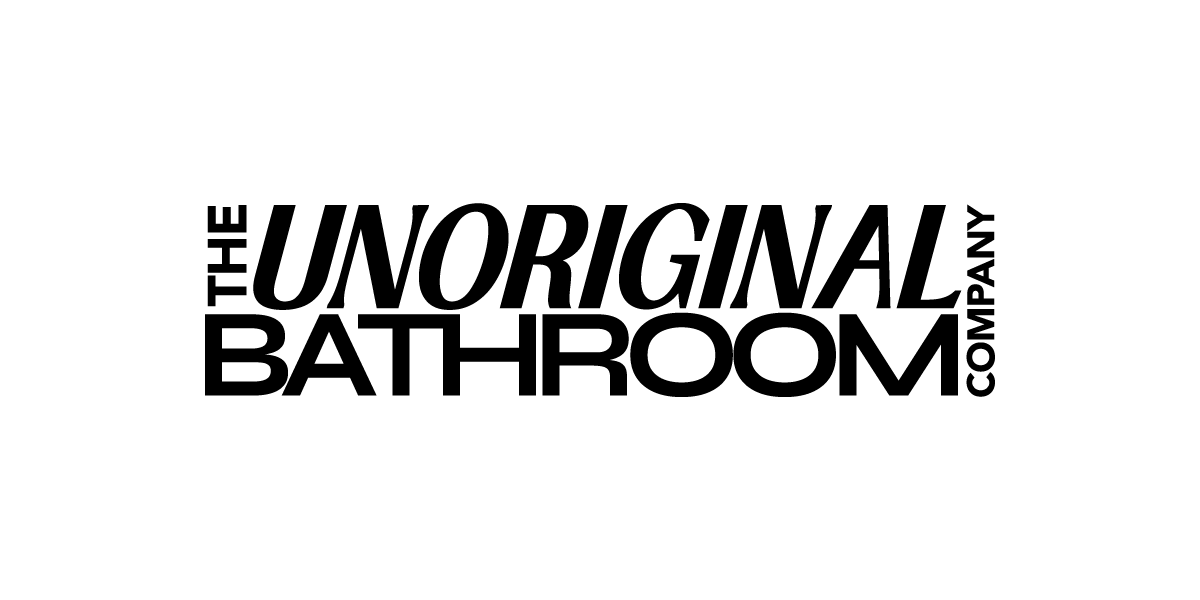
The Masthead
-
This sits nicely together in a block. With the different fonts and sizes, it creates dynamics in the logo. There’s hierarchy in the wordmark, like the word “Unoriginal” at an angle is like pointing at the “bathroom”. It’s like “company” is holding all this together at the end there. Each word is different but it fits together like a puzzle. It’s almost like a magazine title, like the April issue of the unoriginal bathroom, hence the name “the masthead”.
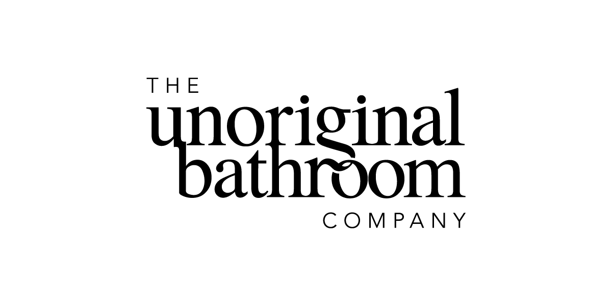
Timeless with a Twist
-
When I was exploring the logo concepts, I was thinking what is a typeface that is classy and accessible for all. Times New Roman came to mind. Everyone knows this font, and it adds a touch of familiarity.
I’ve paired Times New Roman with a light weight san serif font to balance it out. You can see how the characters here interact with each other, some are linked, some are intertwined. And stacking them this way helps to shorten the name visually. It is simple, sophisticated, and classy with a twist (literally).
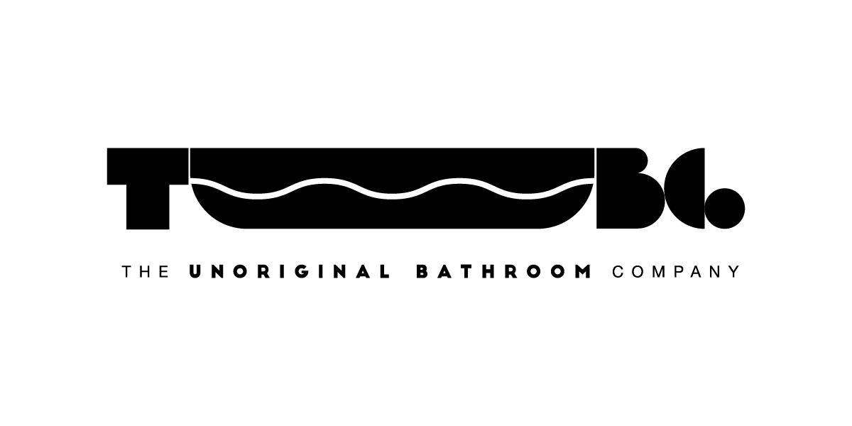
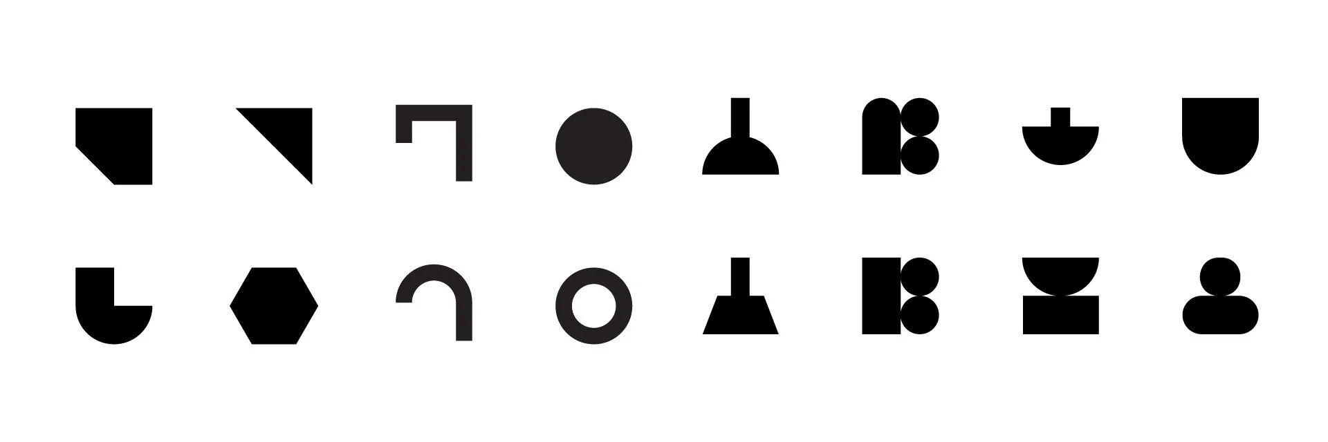
Playful Geometry
-
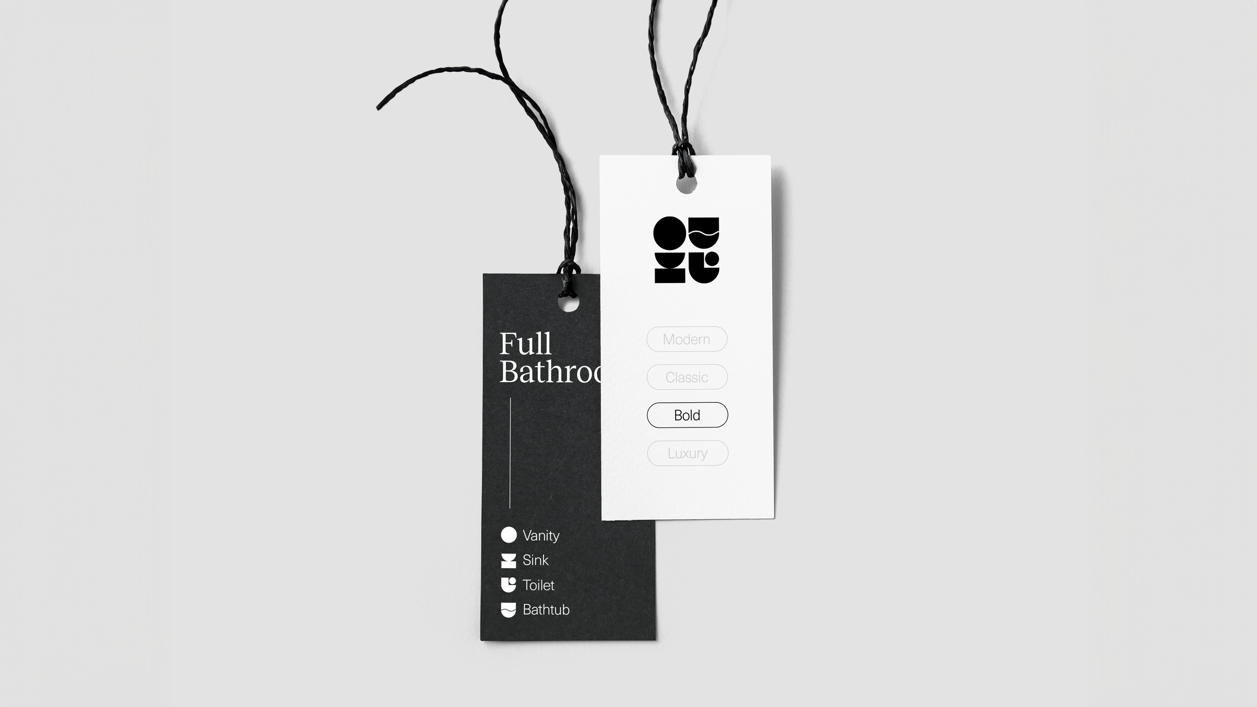
I took the playful aesthetic to heart and created this fun option. The TUBCo abbreviation is being featured here by using geometry shapes like building blocks, like how you can piece the bathroom space together. The U here is an abstract bathtub, with a wavy line symbolising the water. The font here is also kind of blocky, to tie in with the graphics here.
Development
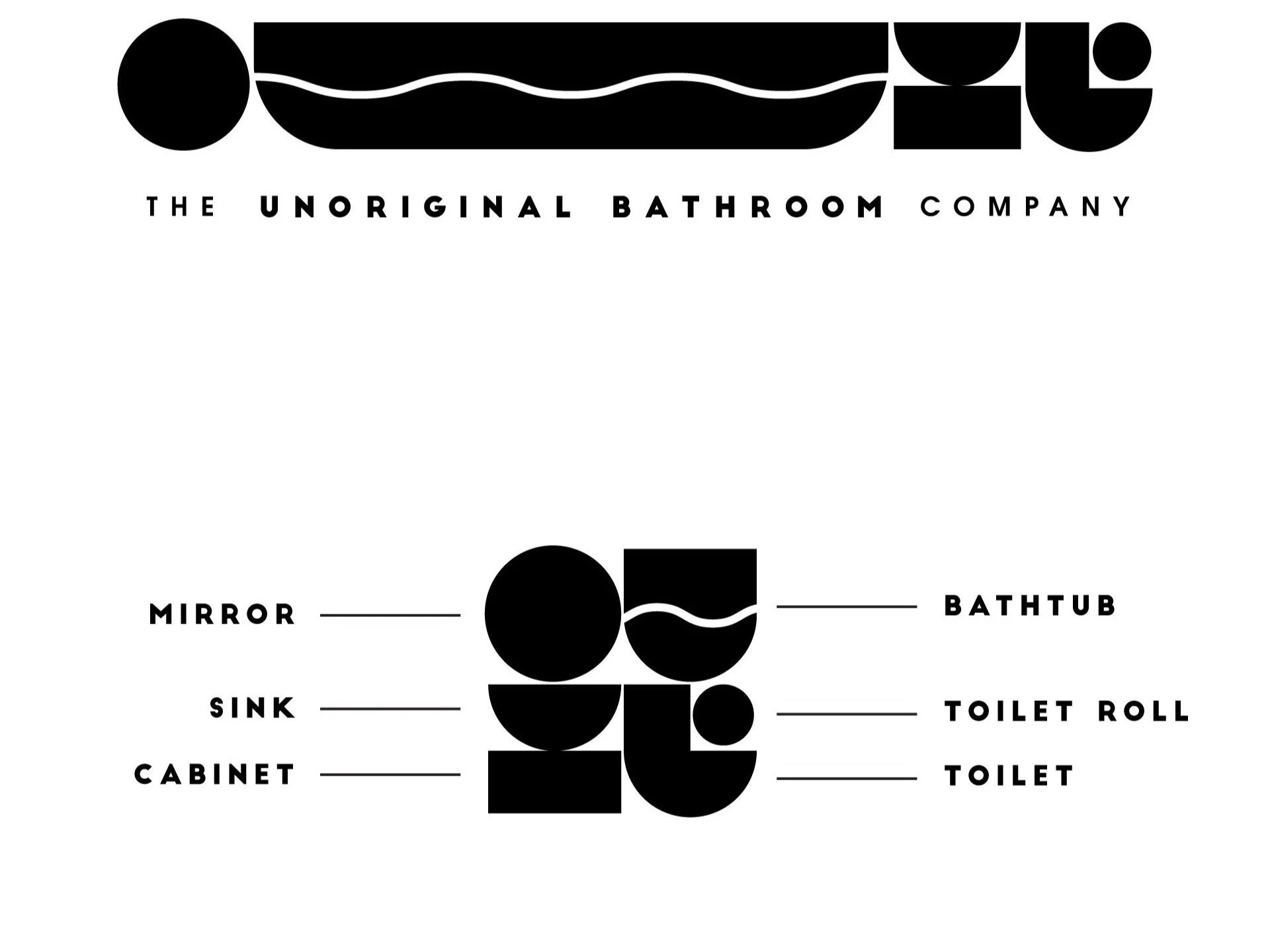
The client loved all the options, and decided to move forward with the Playful Geometry concept.
The feedback was to go with the geometric shapes, but we should remove the reliance on the TUBCo acronym. I’ve experimented with different shapes to create pictograms of bathroom amenities.
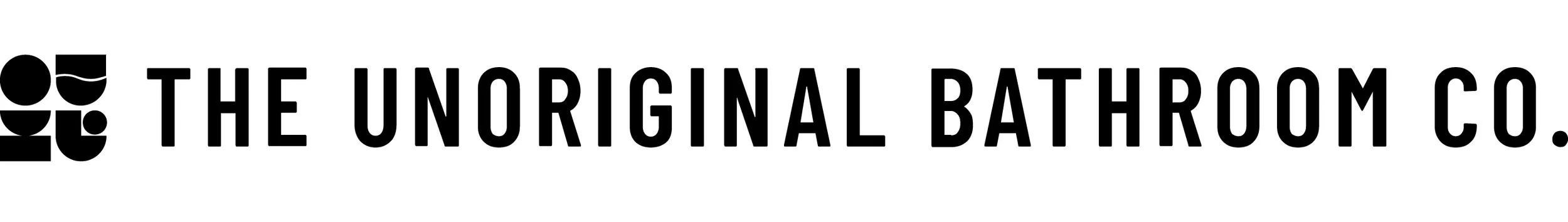
The Final Logo