Restless Leg
Branding.
Logo design.
Restless Leg is an energy drink (consisting of caffiene, taurine, sugar, niacin, guarana, ginseng, and sixteen other proprietary ingredients). It is meant to increase alertness, attention, energy, blood pressure, heart rate, and sleeplessness.
So, I went back to class.
“The example you set for others as someone who discovered and dress herself in the clothing of creativity for its own sake is an inspiration for ALL of us.” – Evan Long, Professor at Centennial College.
I’ve been attending Evan’s classes for the second year now as an alumni and his “teaching assistant”. I was invited to participate in this year’s fake brand assignment (see what I did for my year here) and I present to you: Restless Leg 2025.
Recap of how this works:
Step 1: Select a fake brand.
Step 2: Make 3 mood boards
Step 3: Create 3 logos based on the mood boards.
Step 4: Pick 1 logo and make a brand guide for it.
The Mood Boards
*
The Mood Boards *
We have to create 3 mood boards in 3 distinct art directions.
I wanted to have fun with this, so I’ve opted for a long-ish horizontal layout – almost like a can label :)
-
This is my favourite mood board of out all three.
I asked myself, now that I am at this playground where I can play creatively however I like, “What does Toto like? What does Toto want to make?”
I enjoy Japanese folklore, and the story of the "Night Parade of One Hundred Demons (百鬼夜行)" came to mind. So instead of the competitor brand “Monster” energy, why not “Yōkai” energy?
I thoroughly enjoyed making this mood board. This sparked a lot of inspiration of how the product packaging can look like (e.g. a different monster for each different flavour.) I’m really really happy with this moodboard.
-
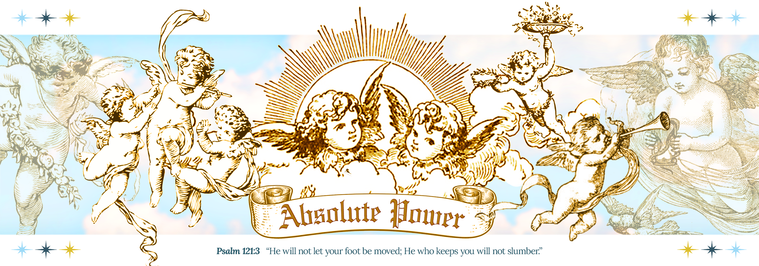
I like taking naps. This idea came to me in a fever dream one sunny October afternoon. “Take Me to Church” was all I remembered.
Church is a place where people commonly get bored and get Restless Leg Syndrome, so at least my dream made sense that way. I grew up in a Catholic environment, and I really felt the concept.
Since the other concept was giving dark and weird energy, why not make this as heavenly as possible?
-
I take my caffeine in coffee instead of energy drinks.
I once had ten shots of espresso in a day. I’ll never forget how fast my poor heart was pumping, how shaky my hands were, how slow everything around me felt, and how hard it was to stop myself from throwing up. I want to capture that over-caffeinated feeling.
This mood board is inspired by Bryan Lewis Saunders’ DRUGS project.
The Logos
*
The Logos *
-
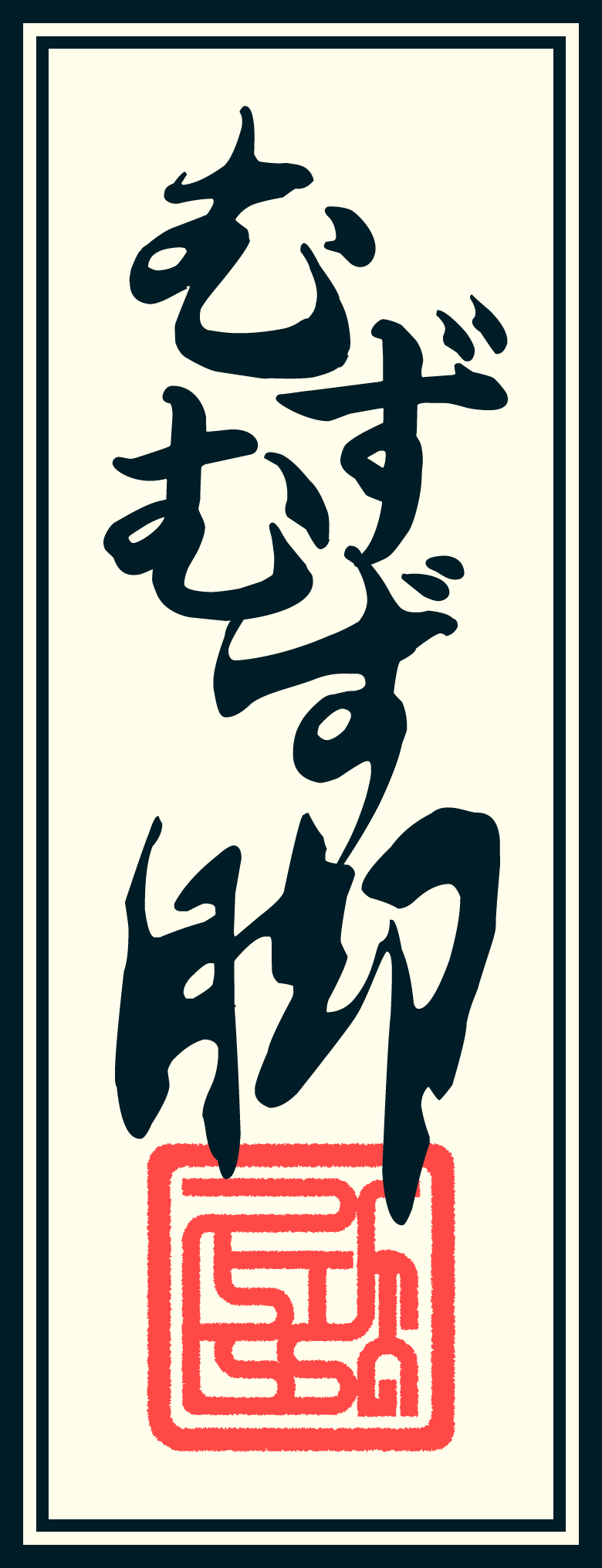
One thing that changed the whole feel for the Yokai Energy mood board is giving each demon their own name tags.
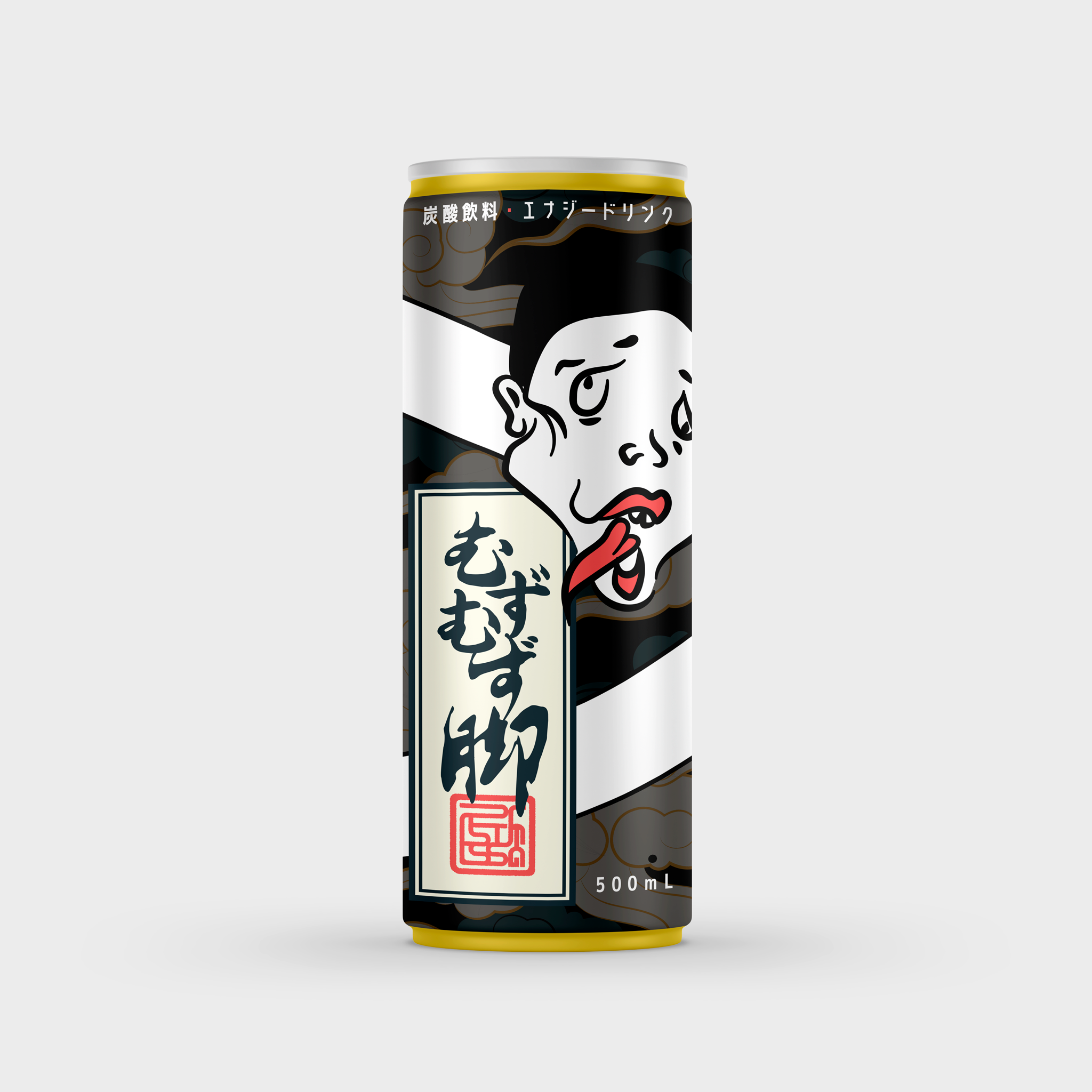
This logo is inspired by the incantation notes used for exorcism in many Asian cultures. I’ve used a Japanese translation of the brand name, and the stamp is actually the deconstructed design of “Restless Leg”.
I was really happy with this when I was done with the design, but it felt like it was missing something with the logo alone. So I made a mockup of the can design to present it. And that made me happier. Totally would buy this drink–even just to collect–if I see it out there on shelves.
-
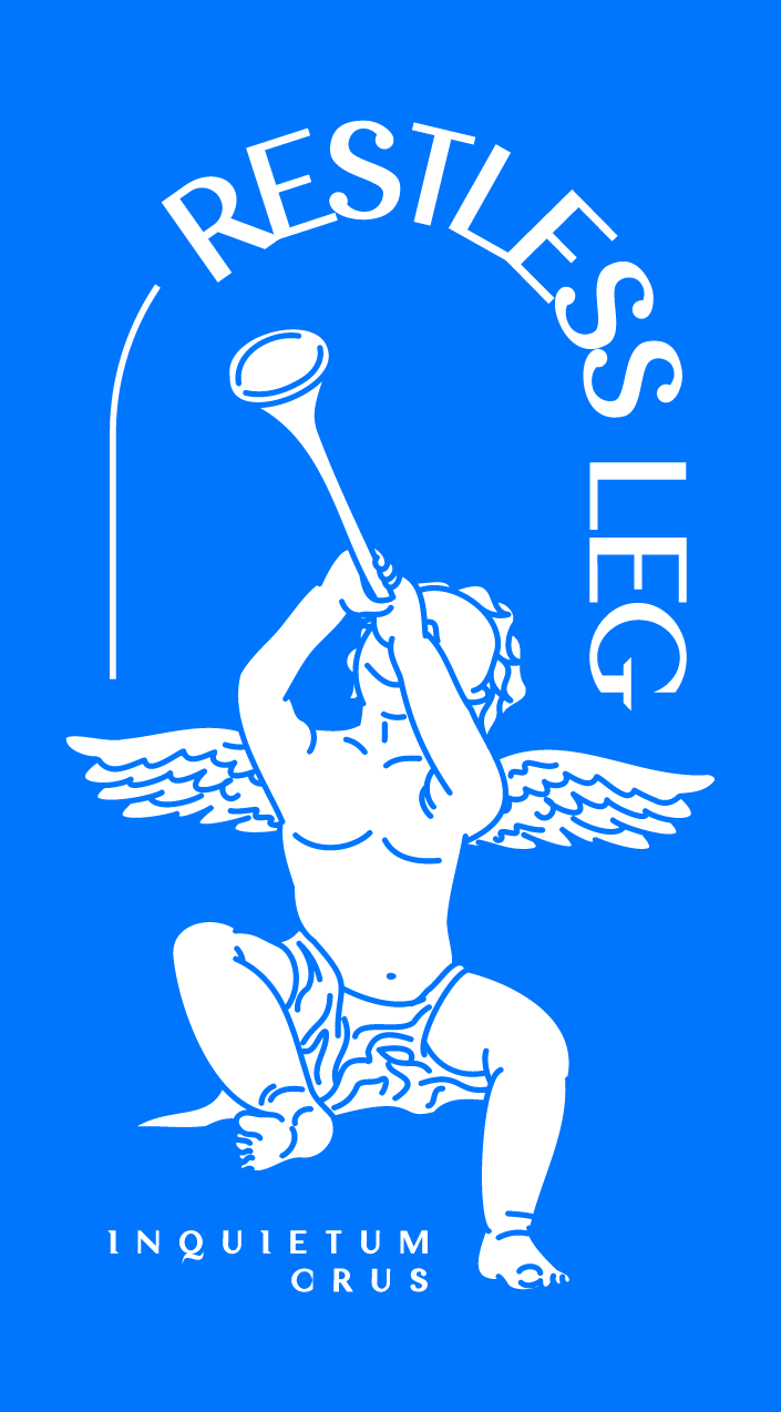
Here comes the religious concept.
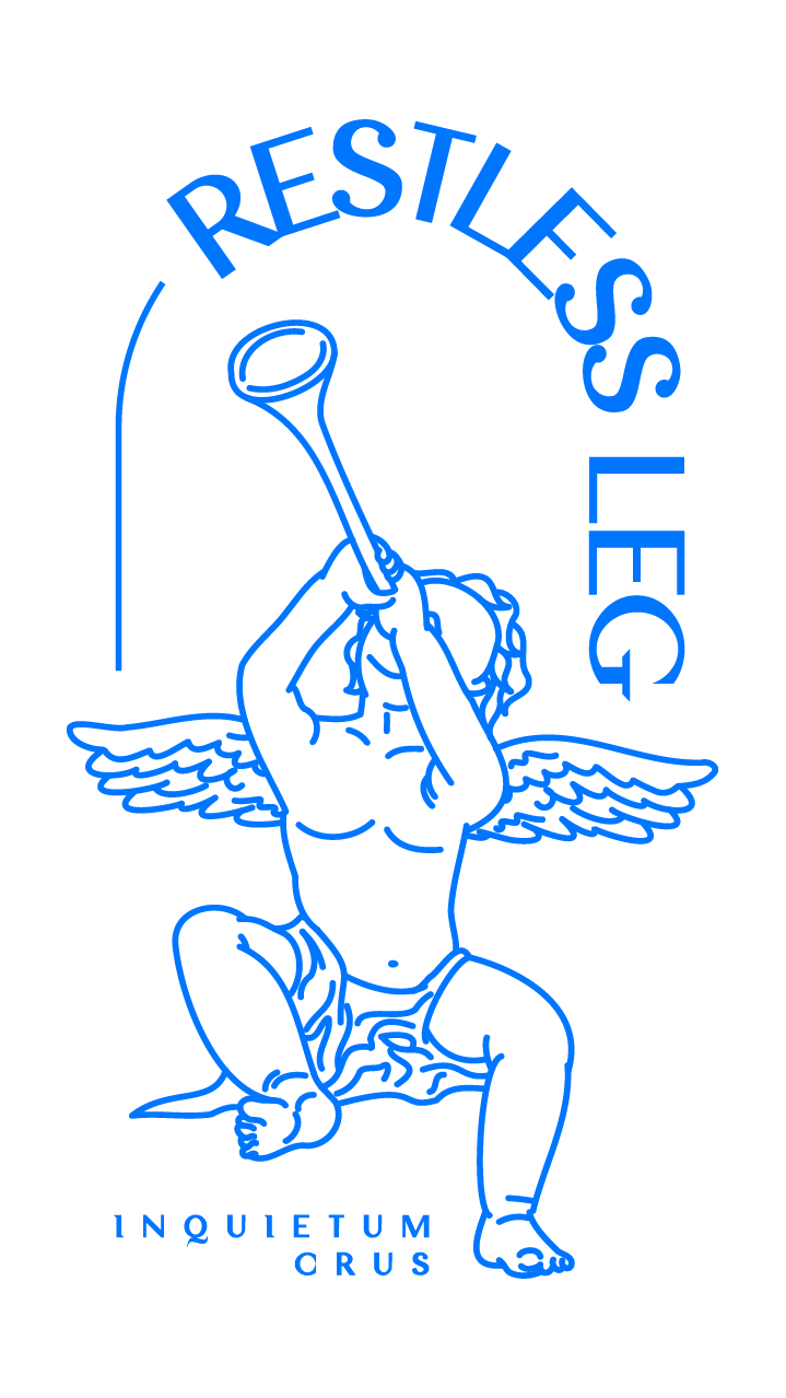
I don’t really know what to do with the logo for this one except for cherubs (well I did add a lot of them into the mood board). So here’s Gabriel with his trumpet announcing not the resurrection of the Son of Man, but the time for you to wake up. sTaY W0kE right? And I added the Latin for “Restless Leg” in there because it is religious, not because it looks empty without it.
Where I’m having my fun with this concept lies in the mockup. When it’s a Catholic concept, the energy drink of course should be in a vial like Holy Water. Peace be with you, Amen.
-
I have mixed feelings about this.
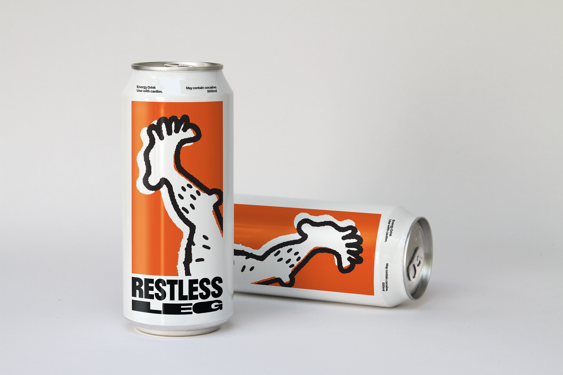
The logo mark is my favourite out of all three, but the word mark and the mockup is my least favourite.
This concept is called crashed for a couple of reasons. First, the slump from the sugar crash we know about energy drinks. Second and the main reason for the name, my Illustrator crashed because of all the effects I tried to add to the word mark. TOO MANY ANCHORS CAN’T HANDLE.
There is definitely something that I can work with here, but hey the is pretty good considered I made this in an hour.
The Brand Guide
*
The Brand Guide *
-
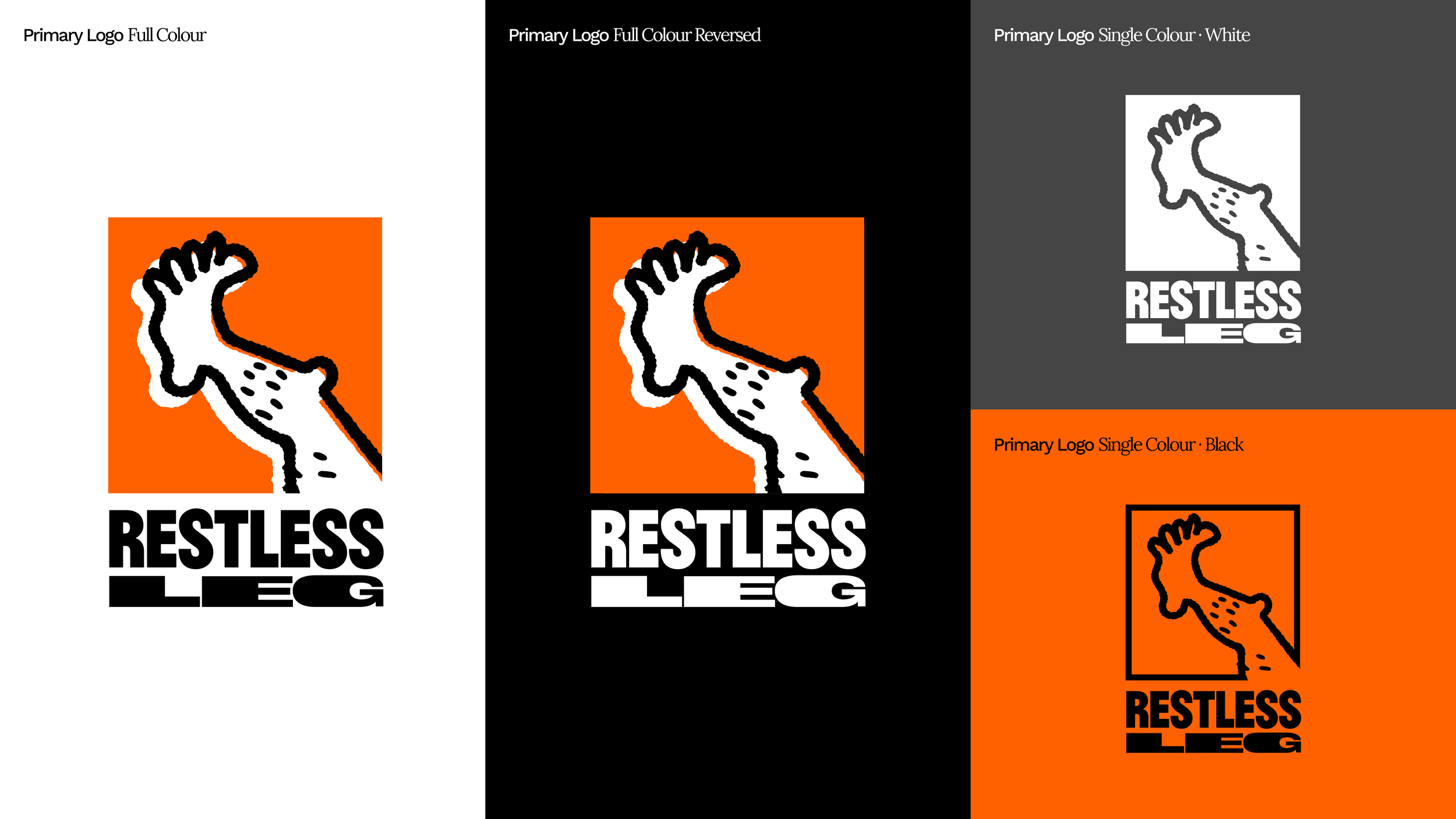
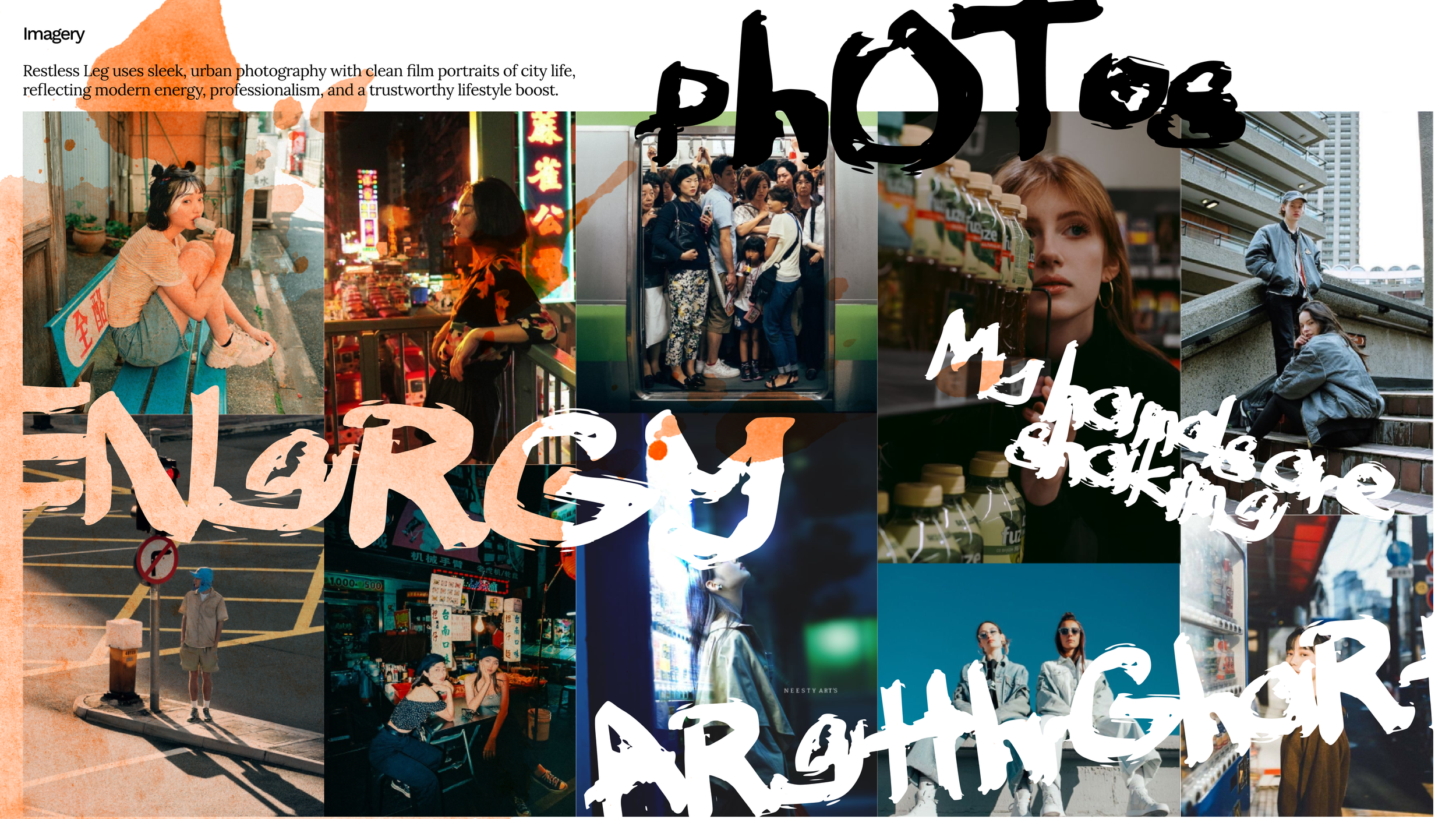
I love the logo mark too much to let it go to waste. Plus, I feel this concept has the most legs (pun intended) and I can have a lot of fun with it.
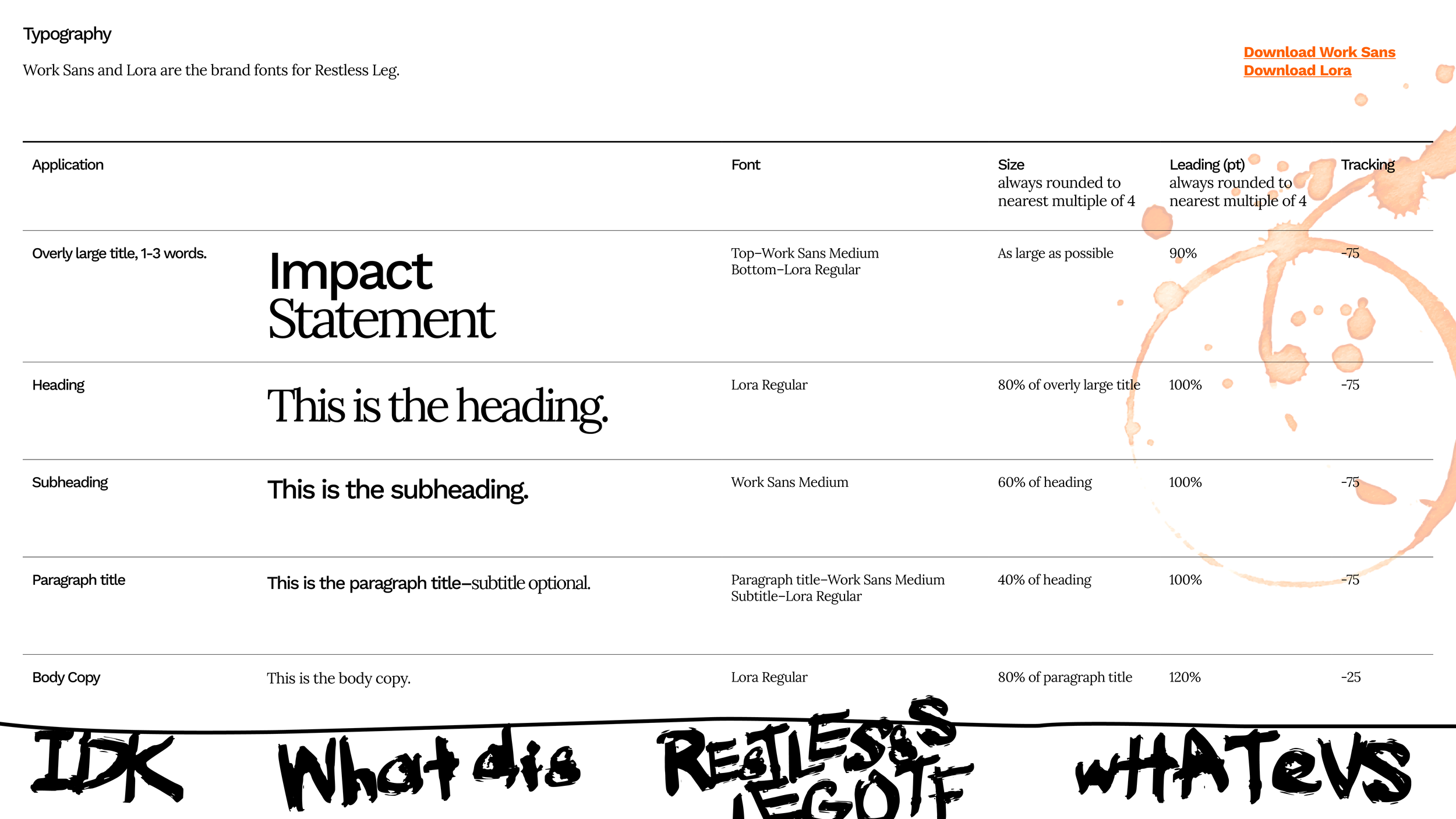
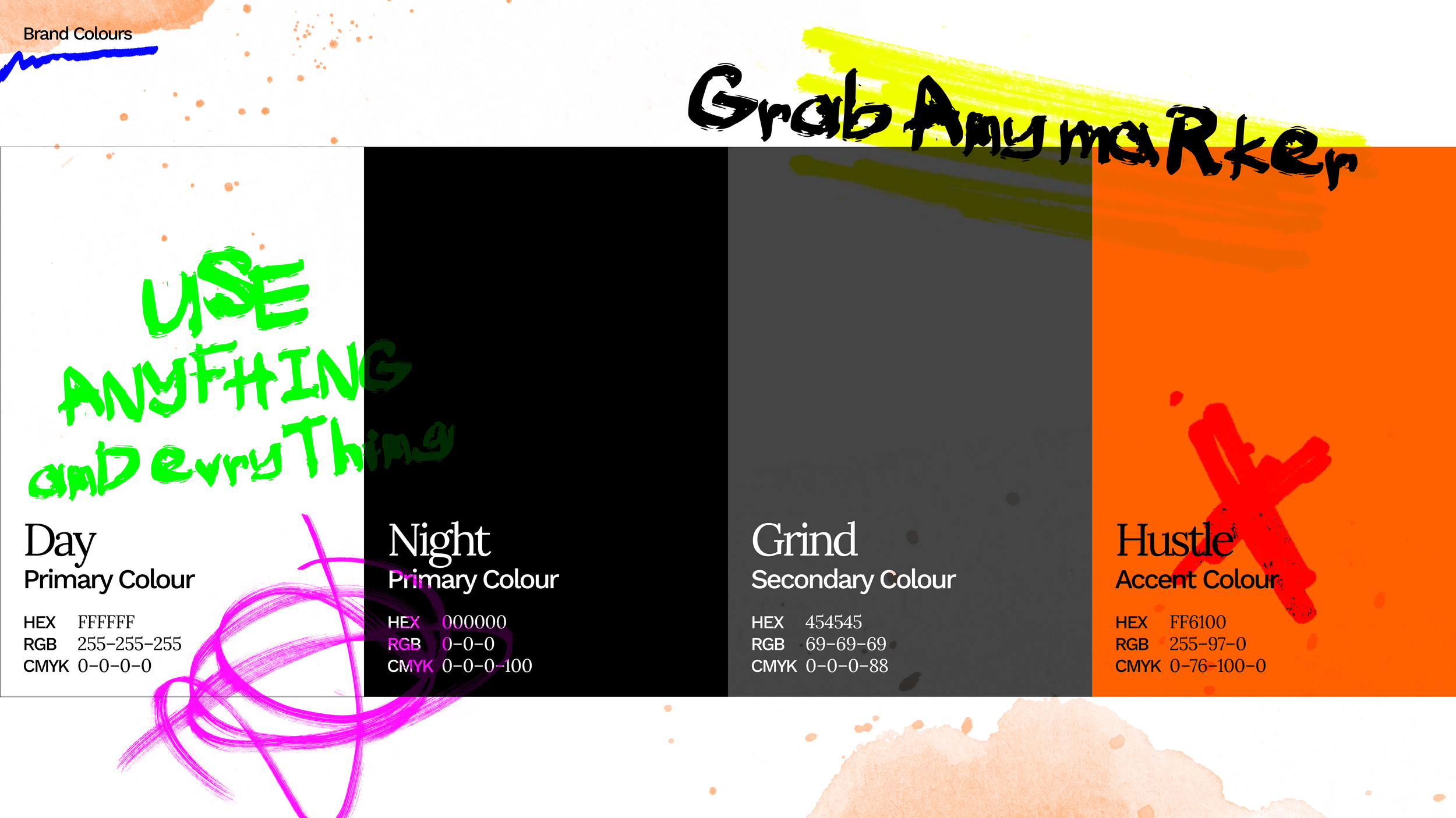
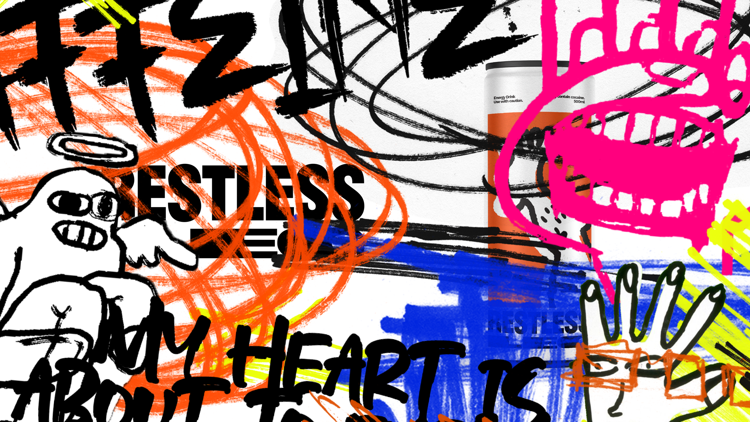
As the owner of an energy drink brand, I feel I have to show I’ve walked the walk in the shoes (I should stop with these jokes). This brand guide is made as if the creator is consuming Restless Leg as they go – starting out really clean and sleek, and getting more and more chaotic with each page.
I’ve updated the word mark for the logo (yay!) ALSO!! I made a custom font for the brand! Had to do a lot of kerning afterwards and Indesign really is not the best tool for it.
Bonus!
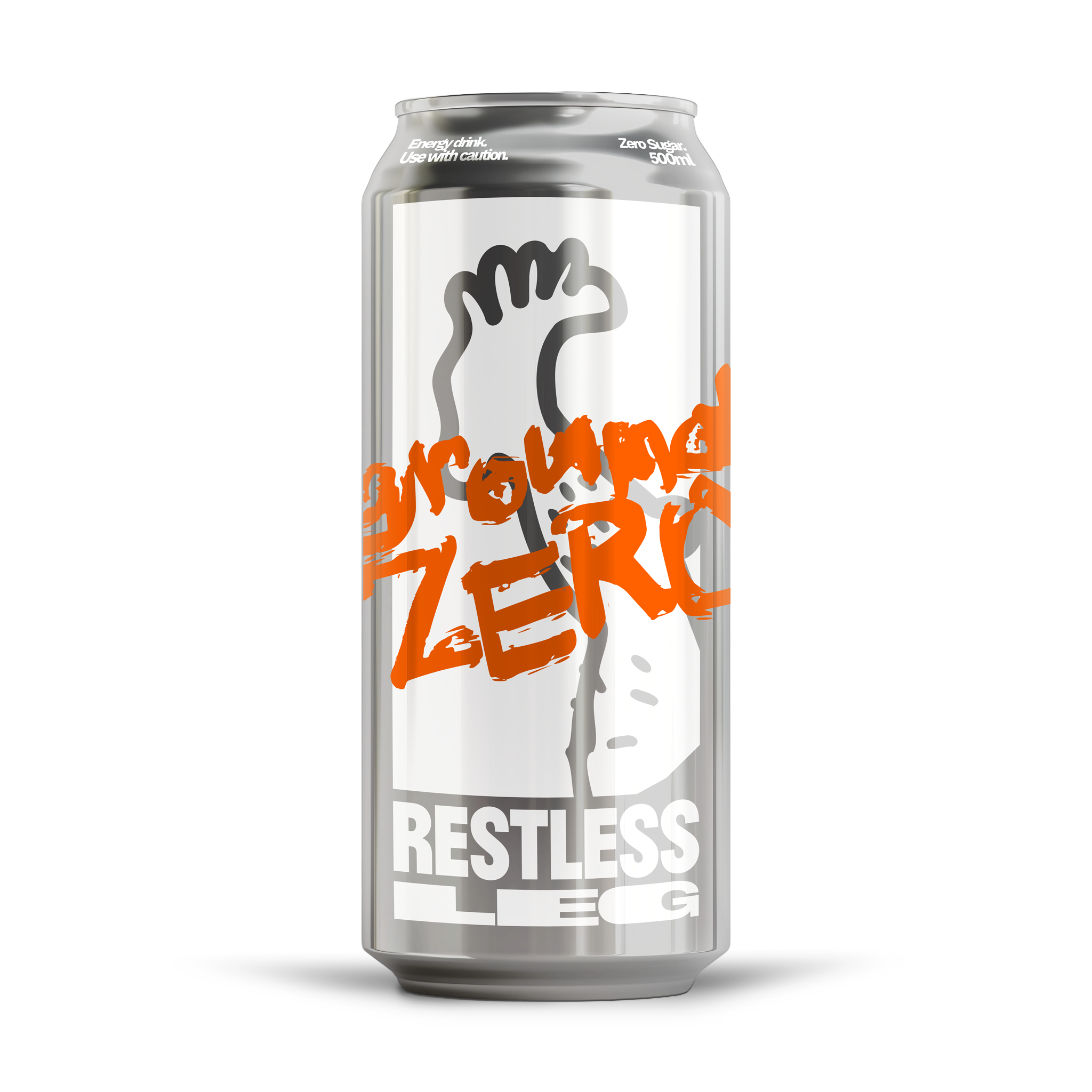
I made a new can design for a product launch campaign!
Presenting: Restless Leg Ground Zero, the sugar-free version of your favourite mess of an energy drink.
Ground Zero noun
The point directly at which a nuclear explosion occurs. Like the burst of energy you’ll get with our energy drink;
Zero–as in “Zero Sugar, Full Power.”

