Poumon Noir
Branding.
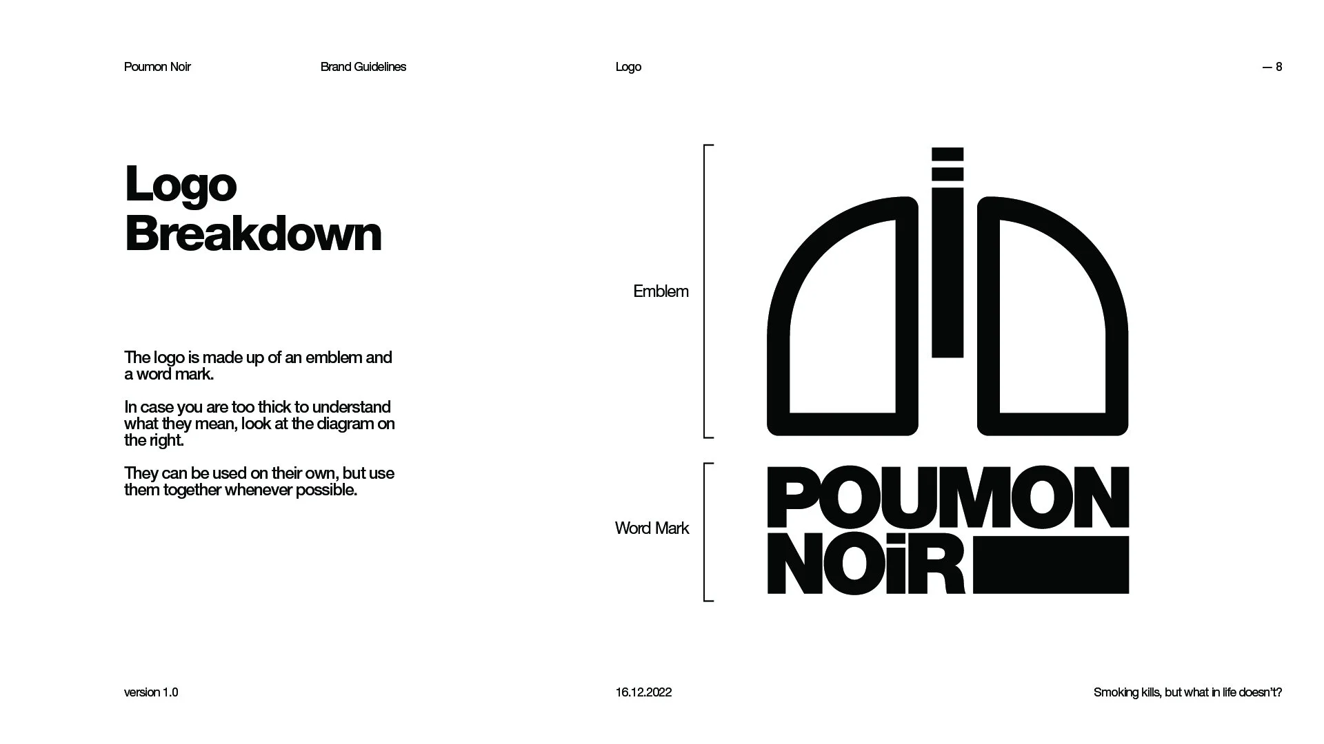
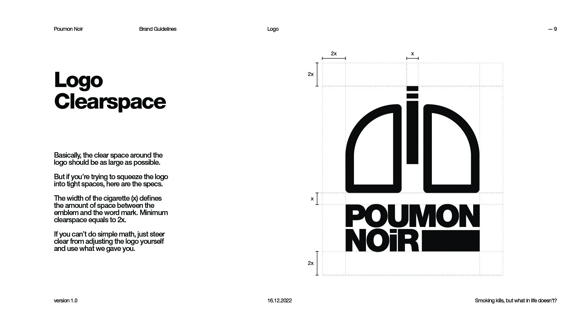
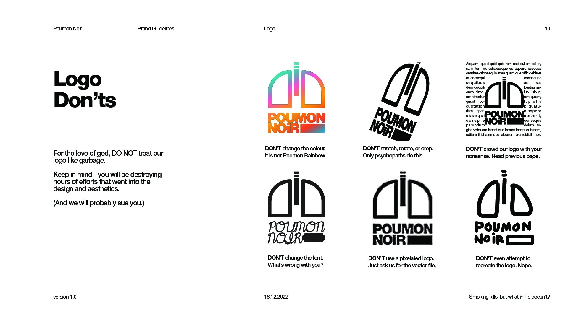
Logo design.
Motion graphics.
The assignment (that actually counts for the grade) for the Intro to Creative Software class at the Advertising - Digital & Creative Strategy program at Centennial College.
See the stupid assignments that don’t count here.
Step 1: Select a fake brand.
Step 2: Make 3 mood boards
Step 3: Create 3 logos based on the mood boards.
Step 4: Pick 1 logo and make a brand guide for it.
Just casually dropping here that I got an A+ for this class.
The Mood Boards
We have to create 3 mood boards in different art directions.
Retro Weirdo
-
I had a job where I worked for the art department in a short film. The film was set in a jazz lounge during the 1960s in Hong Kong, and I was responsible for designing the packaging for cigarettes and match boxes.
I did a lot of research back then, and I noticed how bizarre the ads were in the olden days. It was like the people had this eureka moment of ‘oh damn we can stitch images together’ and went nuts on the graphics.
The moment I picked my brand I knew I had to include these strange ads.
-
I started off with research on vintage magazine and catalogue layouts. I want to create a dated, retro feel for the mood board to match with the aesthetic of the 50s ads.
I gathered some of the weirdest ads (not limited to cigarettes) and put together the board. I wrote some silly copies for some sections to set a comedic tone.
I was listening to Scott Bradlee’s Postmodern Jukebox to get into mood, and I realised they have a rendition of Love Story, so I added the Spotify link to the board.
Mono Minimal
-
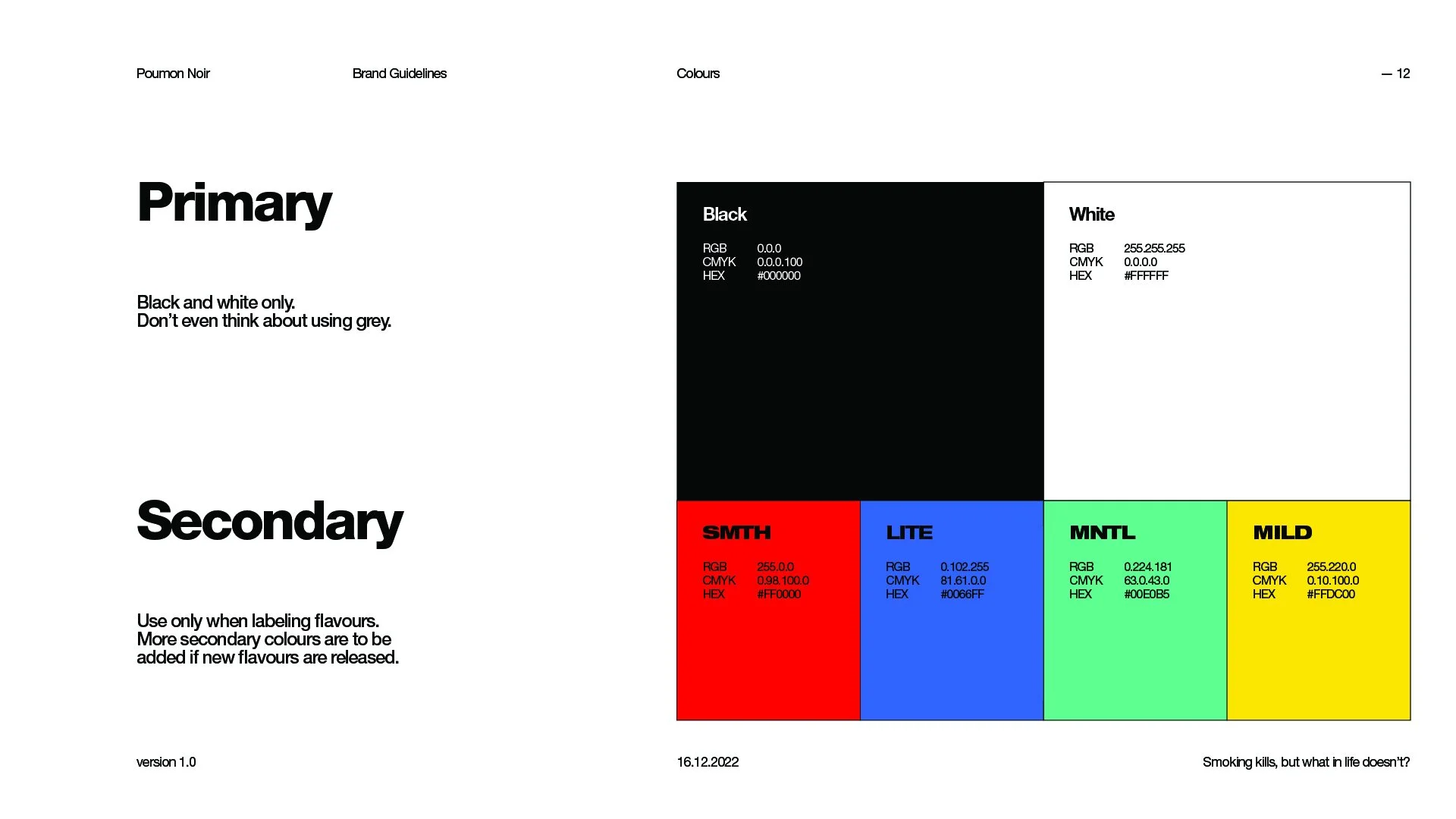
‘Noir’ struck me when I read about the brand. I only understood the joke when I google-translated Poumon Noir i.e. ‘Black Lungs’.
So obviously I had to make a black and white mood board to pay homage to the name. (Plus I really like black and white minimal style :) )
-
I want this to be straight forward, no BS. I lined up the guides, cropped the images, and put the board together fairly quickly.
I struggled for a while whether or not I should add the accent colours into the board. I tried a few options and I think it looks better with the accents.
The hardest part was to find a Love Story cover that matches the board. This is not the perfect song, but it’ll do.
Funky Groovy
-
I was binging The Office the other day. Michael was regretting some stupid mistake he made and said, ‘Let’s tell her it’s opposite day and get it over with.’
That’s when it hit me: I can put the tobacco brand in an opposite direction.
I immediately thought of the funky 70s disco palettes and ran with it.
-
I looked at a lot of trippy psychedelic graphics for the background. I decided to go for the classic wonky sunburst because it really screams the funky style I was going for.
I want people to look at the big ‘Poumon Noir’ in the center, so I put colourful packaging designs with the flat graphics and groovy typography in the back. This doesn’t look like one of your ‘normal, traditional’ mood boards but I hope the vibe came through. It’s all about the feeling, eh?
The Love Story remix for this mood board has a really nice album cover. Maybe another style next time.
Retro Weirdo Logo Guide
-
It all started with the tagline I came up for the moodboard - ‘For a bonsoir, smoke a Poumon Noir!’
What better to symbolise nights than the moon? Originally I wanted to make a good Christian moon (like with halos and angels), but I chickened out because I don’t want to get cancelled by Jesus believers.
Then I started sketching and I finally ended up with this. This is the best logo I have ever made. Not even for my actual paying jobs have I worked so hard.
-
I took a picture of my sketch, threw it in Photoshop, turned up the threshold so it’s black & white, threw it in Illustrator, image trace didn’t work so well, so I drew it stroke by stroke. I was at the logo for 6 hours. I almost fell over when I finally stood up because I couldn’t feel my legs.
The reversed logo was such a pain in the a. I haven’t been sleeping and this took me longer than it should. I almost cried when I did it.
This is the pinnacle of my life as a designer. I’m really proud and happy about the logo and I really hope you like it too.
Weird side note: The more I look at the logo, the more it looks like Stefan Karl / Phil Dunphy from Modern Family. (I didn’t reference them at all.)
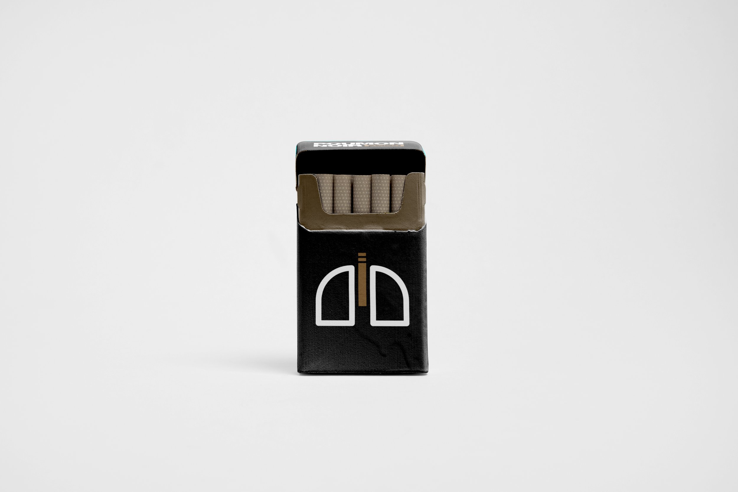
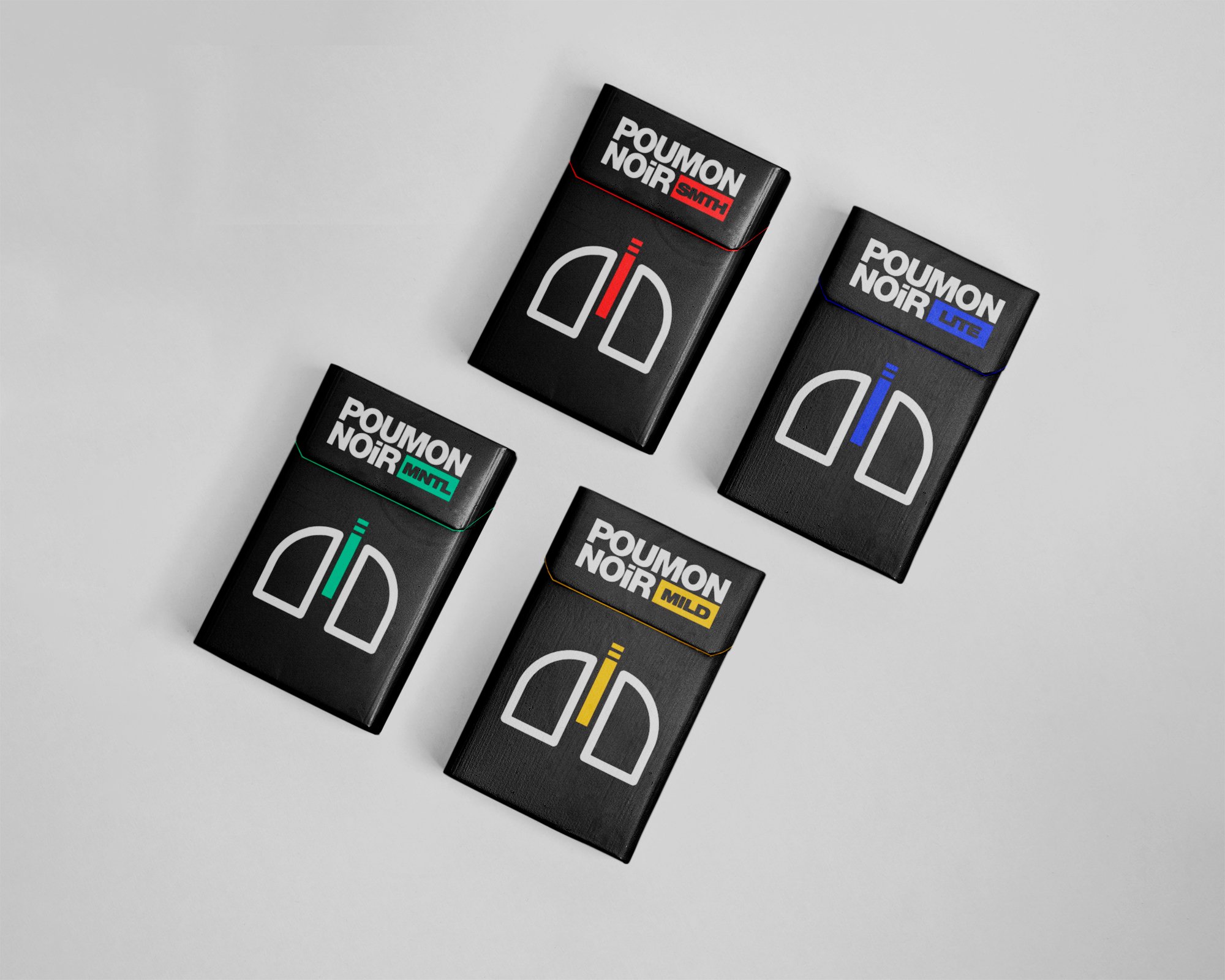
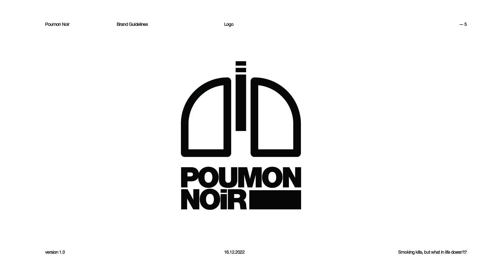
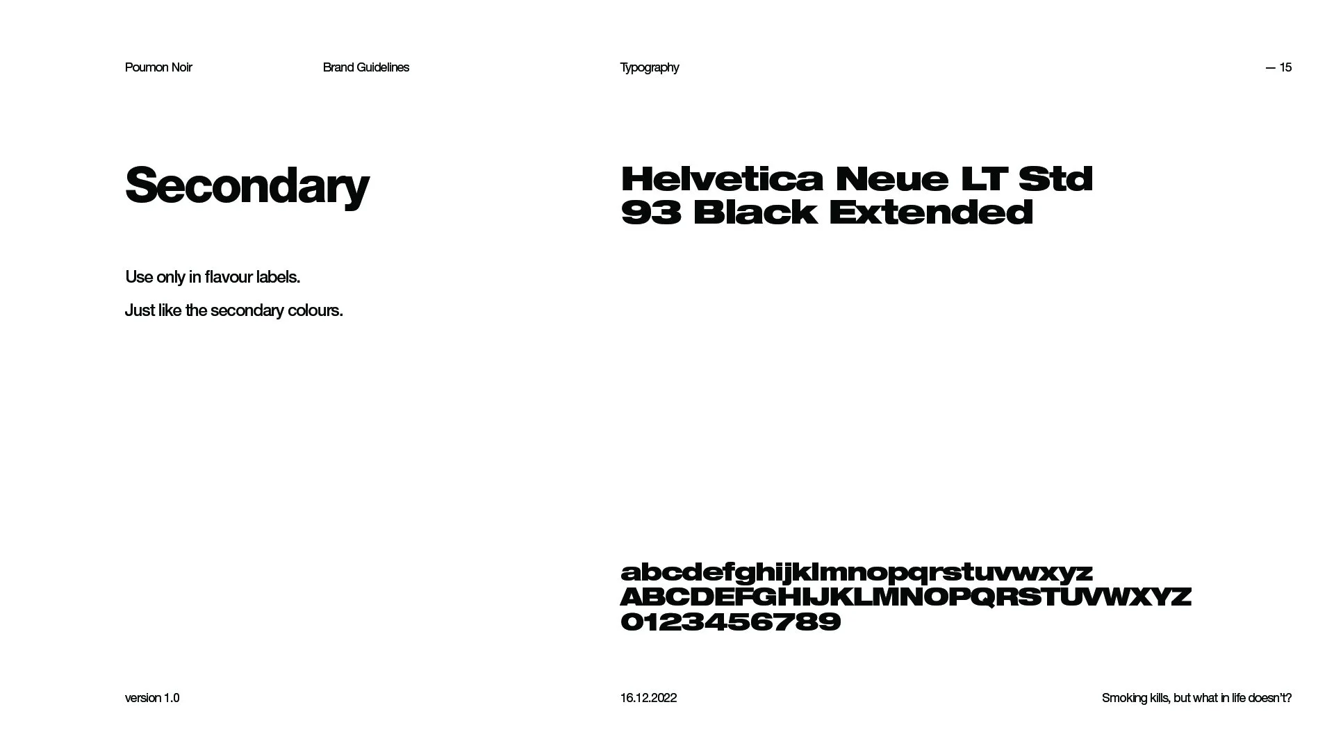
Mono Minimal Logo Guide
-
I actually had this idea already when I was making the moodboard.
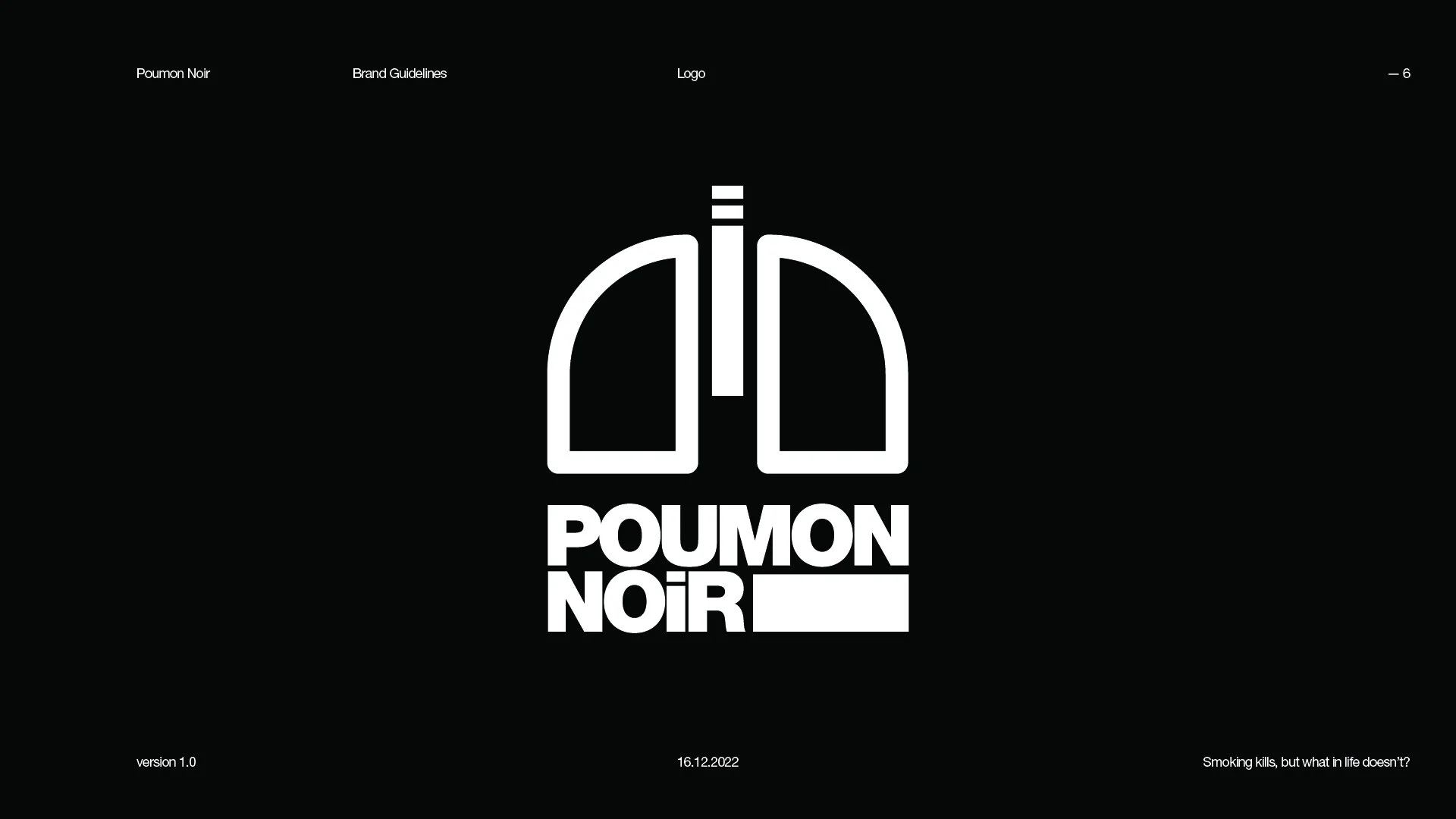
It’s a pair of lungs with a cigarette as the trachea. Nothing much to say about this - it’s straight forward.
-
This is a quick one.
I originally wanted to make the Os in Poumon Noir to look like the lung shapes I got. I experimented a lot but they all look like Pauman Noir, so I scratched that.
The hardest part of making this logo is to line up the flavour names in the tiny box. Who knew menthol is such a long word?
Funky Groovy Logo Guide
-
I want this to be just words unlike the other graphic ones, but I guess the words themselves are also kind of like graphics?!
I obviously didn’t plan well when I starting drawing the words, and there was this huge ugly gap when I finished the R in noir! I thought of using peace signs or flowers for the hippies vibe! But then I remembered my professor always signs off his name in the emails with exclamation points! Maybe he’s not that excited but it sure looks like it! So! I! Added! That!
-
I originally wanted to use envelope distort for the logo to save time, but ‘poumon’ just doesn’t want to look good! So I drew letter by letter in Photoshop and used liquify to move around stuff! Then I image traced it! (It finally looks good!) I split it and added the caption in between poumon and noir with type on a path!
Then I remembered I need to include the assignment requirements! So I made a happy face and rainbows pattern! But I didn’t know patterns cannot be added to swatch groups!


New Flavour Alert
⋆
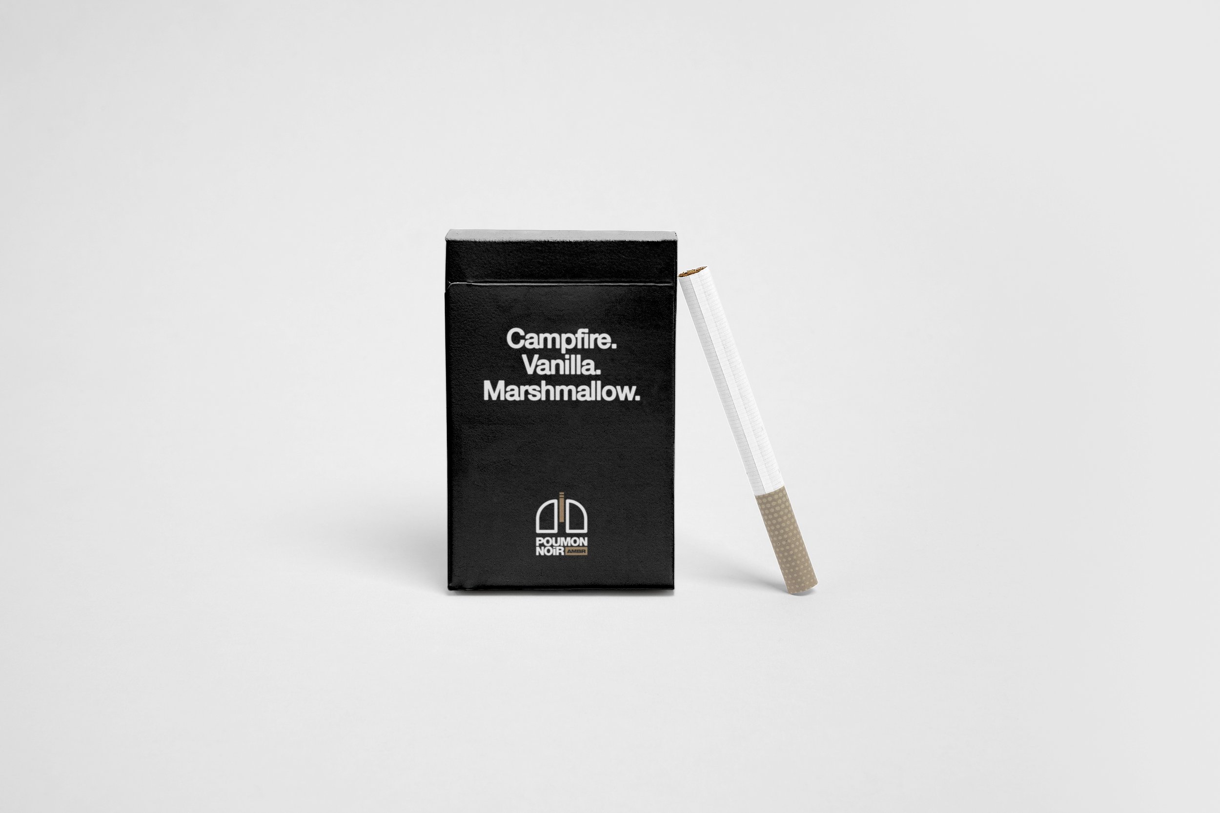
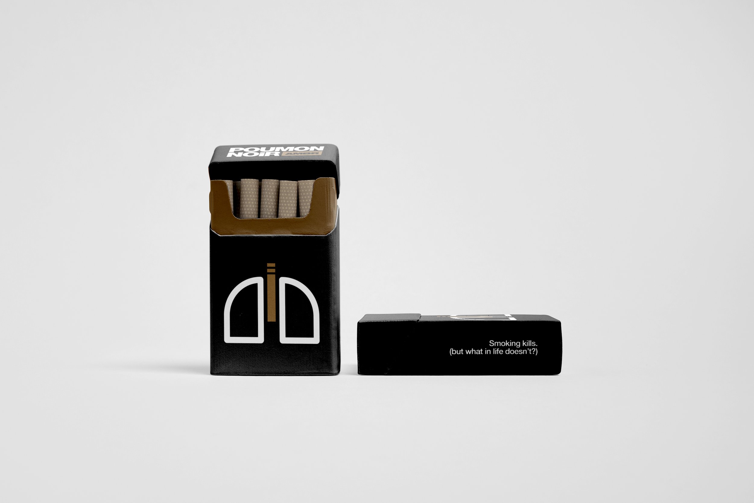
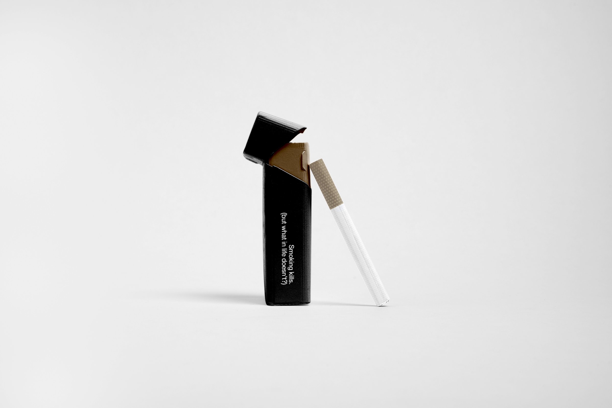
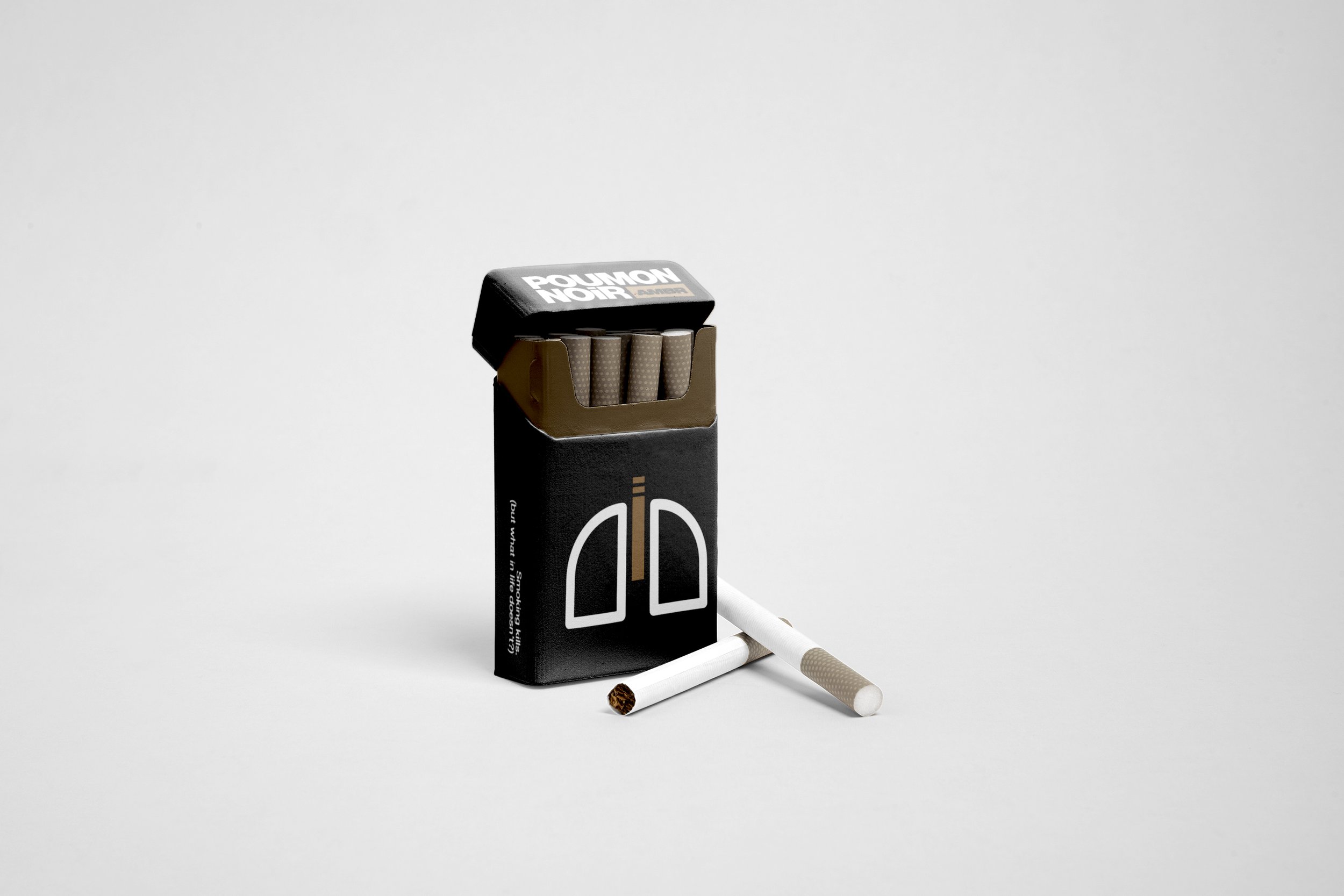
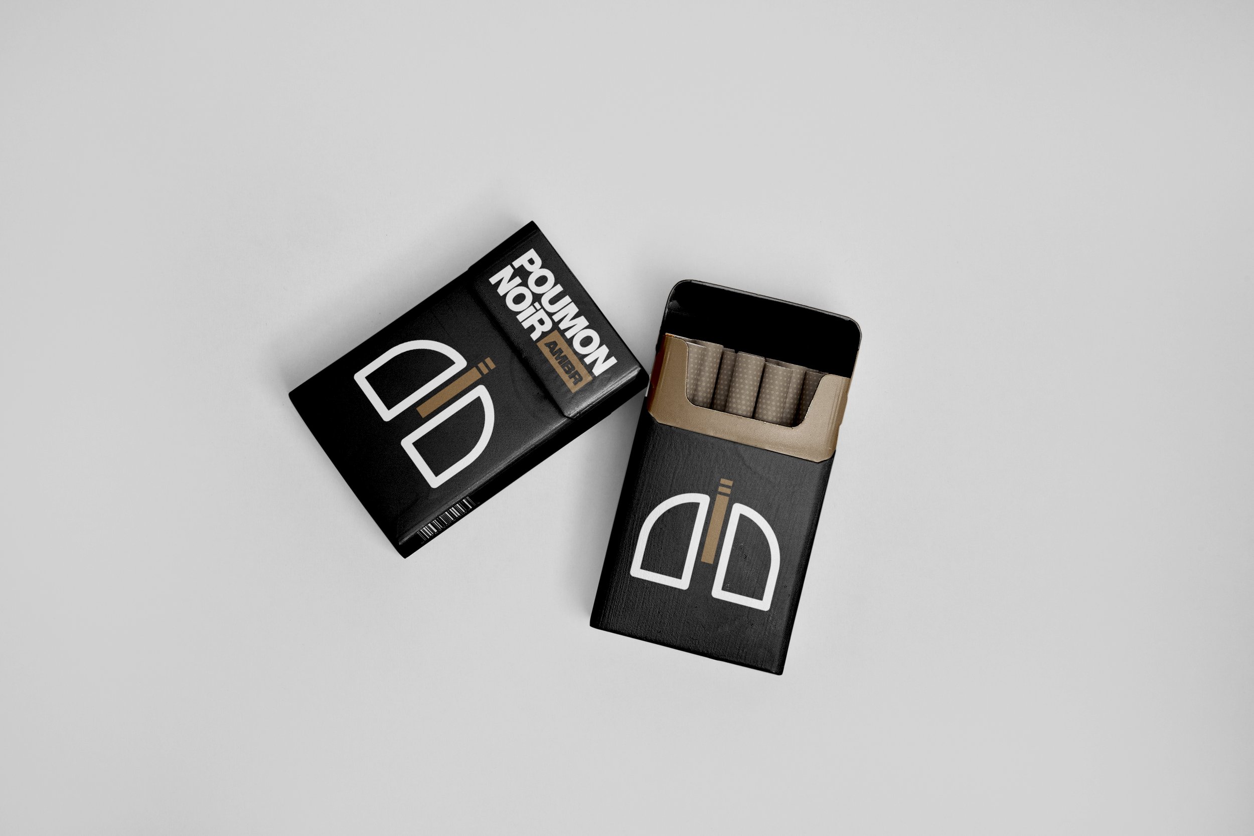
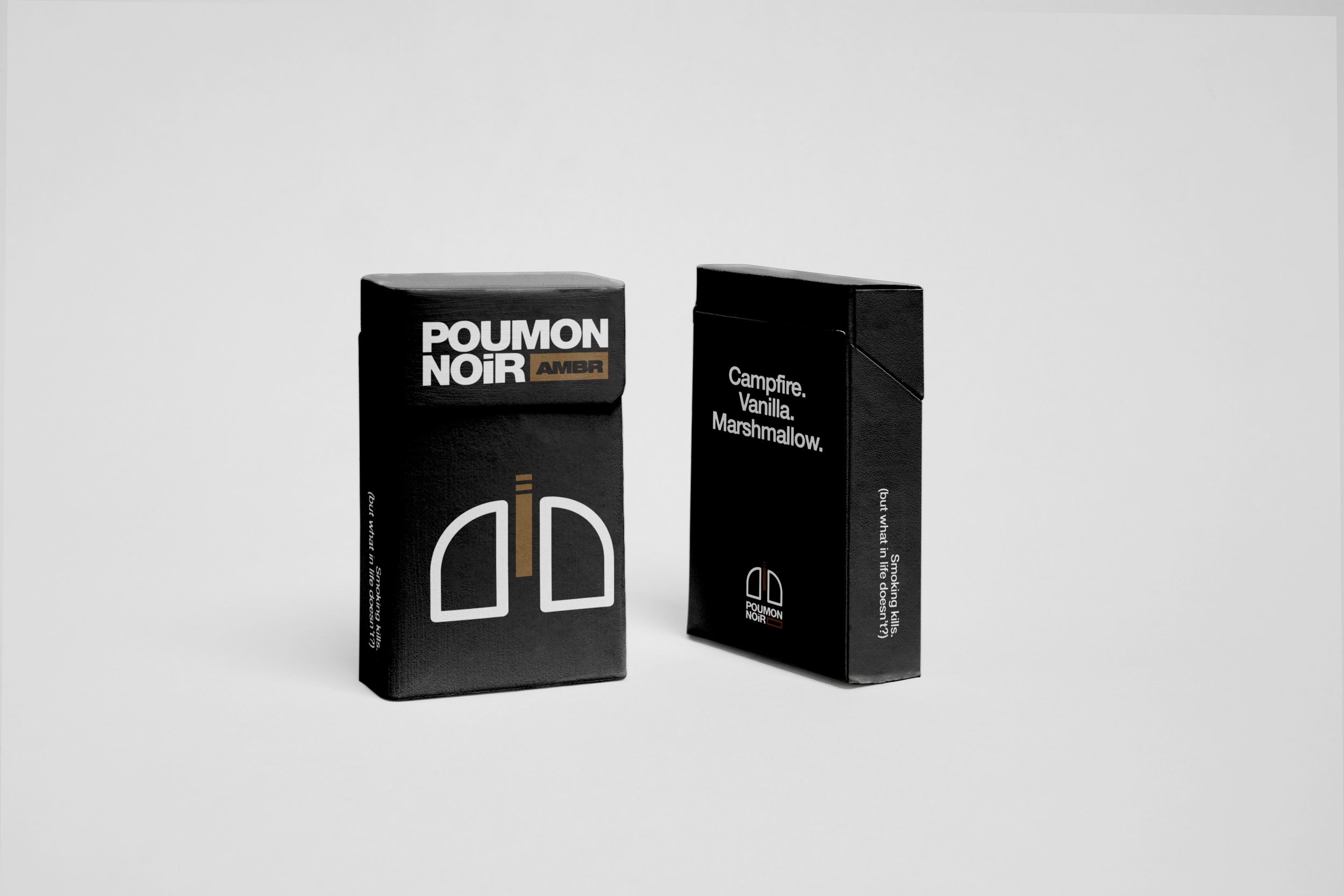
Poumon Noir AMBR
⋆
New Flavour Alert ⋆ Poumon Noir AMBR ⋆
Poumon Noir AMBR tastes like:
campfire, vanilla, and marshmallows.
The newest Poumon Noir flavour evoke nostalgic feelings of youth, freedom, and a bygone era when smoking was an accepted public leisure activity.
Nothing fancy... no frills, no gimmicks, no technology - just straight-up old-fashioned cigarettes like your emphysemic grandmother used to enjoy in-between coughing fits.
Created for the Collaboration course.